


Here's a mix of writings of opinions and analysis. Setup is loosely inspired by Taylor.Town.
Latest Post:
Wings on Drag Cars (2026-04-28)Link
A little while ago, I was sent this.

A foxbody Mustang which is, according to the comments, either a street racer or no-prep car. Basically, a drag car for low grip surfaces.
Now anyone who's looked at any drag car has noticed that a lot of them have wings and spoilers.

At the top fuel level, where power figures approach or surpass five digits, I don't think it's too difficult to imagine a car that's grip limited for a significant part of a quarter mile (and Top Fuel does only race to 1000ft). But at a heavily modified street car level? Where I think it's pretty well known that most cars aren't struggling for grip for very long? That seems much more interesting to look at.
| Property | Value | Unit |
|---|---|---|
| Power | 500 | hp |
| Mass | 1200 | kg |
| Front Weight | 0.5 | % |
| Friction Coef | 1.5 | |
| CdA | 0.6 | |
| Air Density | 1.225 | kgm^2 |
Before I get carried away and end up trying to code a clutch release simulation and get lost designing a tyre model and launch control system, let's start simple. A spreadsheet simulation of car doing a 0-to-400m run. Constant power for the engine, aerodynamic drag as the only resistance.
load = (1 - front weight) * mass * 9.81
//for brevity, friction coefficient of the tyre is mu.
thrust = min(power / speed, mu * load)
//thrust, the driving force of the car. Speed is used from the last timestep of the simulation.
drag = 0.5  air density  speed^2 * CdA
//drag, the aerodynamic resistance. CdA is drag coefficient multiplier by area
acceleration = (thrust - drag) / mass
speed += acceleration * timestep
distance += speed * timestep
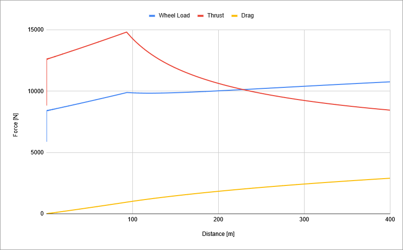
And we get this:
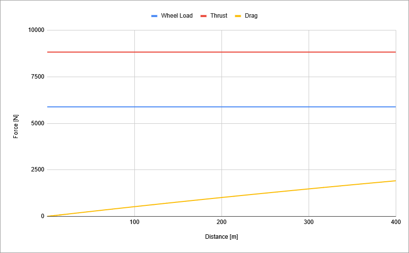
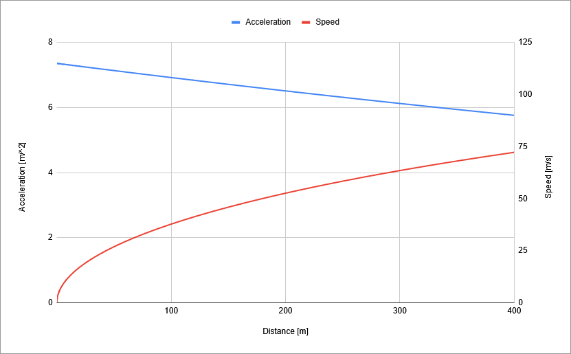
Which... hmmm. The car's grip limited for the entire distance. Not exactly the best depiction of a car going down a drag strip.
Well, none of the numbers feel unreasonable (if anything, a mu of 1.5 might be optimistic. The tyres on that foxbody look dirty), although we are talking about a car that magically makes peak power for its entire run. The one feature that might correct things is weight transfer. So far the rear wheels get their 50% of the weight for traction, but with weight transfer they'd get more.
| Property | Value | Unit |
|---|---|---|
| Wheelbase | 2.5 | m |
| CoG Height | 0.5 | m |
Adding weight transfer just requires a wheelbase and a centre of gravity height.
weight transfer = CoG height / wheelbase * mass * acceleration
//acceleration is taken from the last timestep of the simulation
load = (1 - front weight)  mass  9.81 + weight transfer
Numbers plucked from feasible sounding vibes. Let's run!
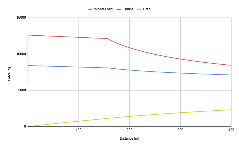
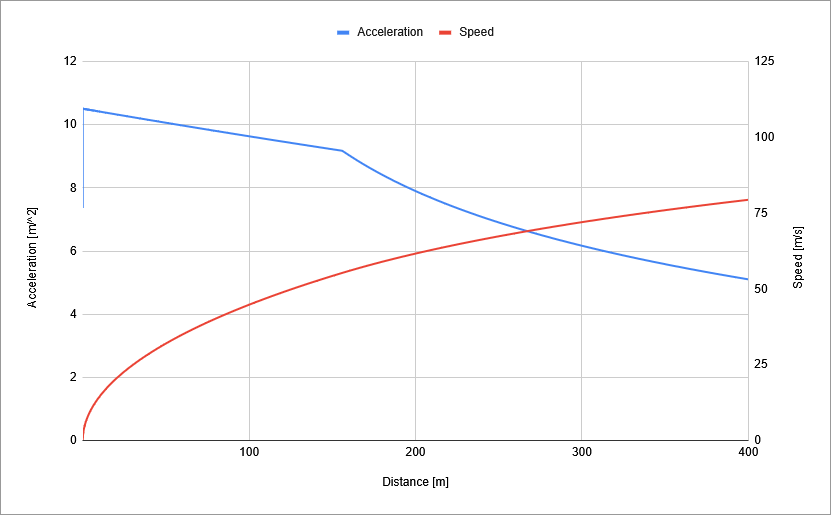
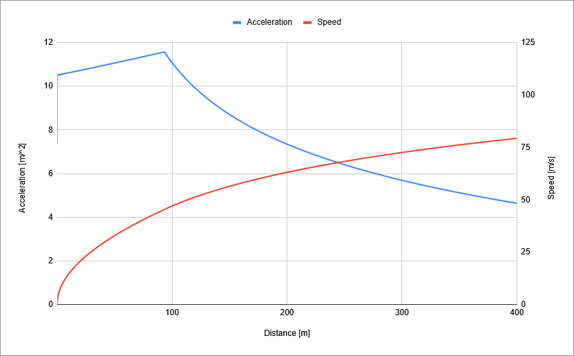
Yeah, I'd say that's better. The car's now grip limited from the launch to about the 150m mark and the load on the rear tyres increases by something like 1700N in the first stages of acceleration. Right at the start of the run, there's a vertical line, basically at 0 metres. That's the most visible example of a little tidbit about weight transfer which is that acceleration creates a positive feedback loop in a rear wheel drive car. The faster you accelerate, the more weight transfer reaches the rear tyres, providing more grip to accelerate with, and so on. It has its limits, as evidenced by the fact you can only really see it trending back down, but this car actually reaches a peak acceleration at 0.09 seconds, before the miniscule amount of aerodynamic drag at those low speeds increase more than the acceleration feedback loop can support. And once the car is no longer limited by the tyres, we get that bowl shape to the end of the run, since thrust is inversely proportional to speed (power divided by speed). Quarter mile time drops from 10.36 to 9.06 too. It's fast for what the numbers suggest, but that's to be expected when we're simulating this in such a basic manner. The point is we now have a reasonable baseline to dump a wing on and compare.
Time to Wing it
I don't want to bog this down with a fully cited and detailed explainer on aerofoils, but over the hundred-plus years of flight there's been a lot of work put into understanding and building a solid approximation of wings. The main framework for this is in Joeseph Katz's New Developments in Race Car Aerodynamics, but you'll be able to find much of what I'm about to talk about in places talking about model planes too. It's all the same stuff. Bear in mind that all the equations in this section are somewhere about the tier of accuracy as using a constant power output: good enough to get a rough estimate, but nothing beats the real thing. We'll assume the wing is directly over the rear axle.
The wing produces two forces, lift and drag. In our case, lift is downforce, pushing the wheels into the road, adding more grip with speed exponentially. This is good. Drag is resistance, slowing the car down. So the question is if a wing adds enough load on the tyres in the traction limited phase to justify the drag it adds in the power limited phase.
A wing has a chord and a span, or in plain english, a length and a width. The other two details we need are a lift coefficient, and a drag coefficient for the wing. Then we just add the wing forces on top of our existing wheel load and drag forces. To save me from making any judgement calls, let's take a wing from airfoiltools.com.
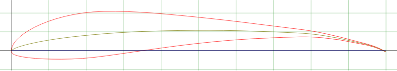
The S1221 is a wing I've been pointed towards for motorsports use back in Formula Student. Airfoiltools.com largely covers known and researched and named aerofoils, which in turn usually means model plane hobbist or prewar NACA research on wings, and the needs of a plane are very different to the needs of a car. There's an S1221 variant here with a 4 degree flap, which is probably as close as I'll find to a multi-element-downforce-above-all wing here. At 14.25 degrees, it produes a lift coefficent of 2.1757, and a drag coefficient of 0.03752.
Sounds great, doesn't it? Well, tragically the wing's drag won't stay that low. The data from airfoiltools.com is done assuming an infinite span wing. As cars are very much finite in width, we need to account for that. A wider, shorter wing, or in other words a wing with a higher aspect ratio, is more efficient because the biggest cause of drag in a wing are the vortices produces by its tips. This is known as induced drag. An infinite wing has no induced drag. The drag coefficient I just listed for the wing is more accurately the viscous drag, the drag from air shearing against the surface of the wing. We add the induced drag onto that.
aspect ratio = span / chord
CDinduced = CL^2 / (pi * AR)
//drag induced from the pressure different on top and under the wing
CD = CDviscous + CDinduced
wing area = span * chord
wing downforce = 0.5  air density  speed^2  wing area  CL
load += wing downforce
//add the wing's downforce directly to the load on the rear tyres
wing drag = 0.5  air density  speed^2  wing area  CD
drag += wing drag
//add the wing's drag on top of the car's drag
| Property | Value | Unit |
|---|---|---|
| Chord | 0.3 | m |
| Span | 1.5 | m |
| Area | 0.45 | m^2 |
| Aspect Ratio | 5 | |
| CL | 2.1757 | |
| CDviscous | 0.03752 | |
| CDinduced | 0.30135 | |
| CD | 0.33887 |
So to get that pretty immense lift coefficient, we have to induce eight times more drag on top. No such thing as free lunch. But how does the winged car fare?
The big news is that suddenly, the traction limited region becomes shorter because the car's accelerating a lot faster, with a lot more grip on the tyres, and we reach a point where there isn't enough thrust to use all the grip of the tyres sooner. Whereas previously acceleration declined as thrust stayed constant and drag increased, with downforce in the mix the car actually accelerates harder as it goes faster. The car is a 0.16 seconds faster.
It's a little difficult to compare seperately, so let's overlay the results. The winged results are dashed lines.
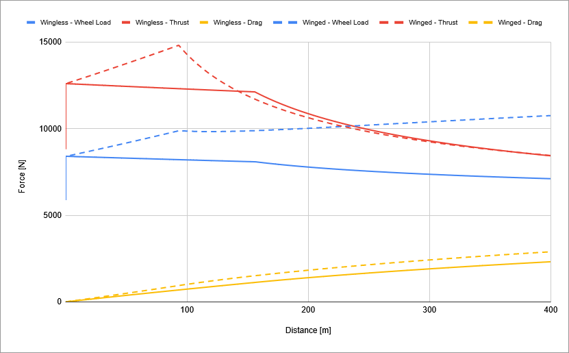
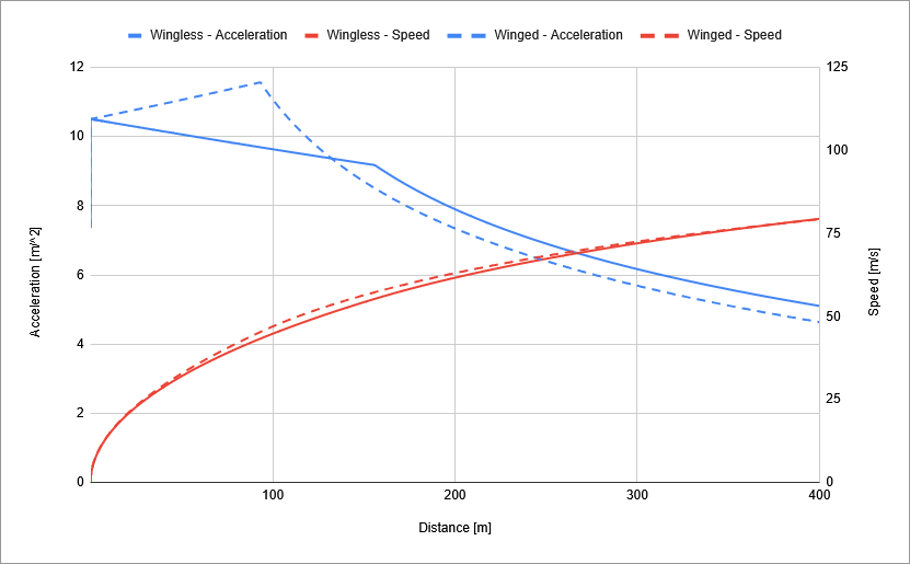
The winged car is faster, clearly. The thrust curves show how the winged car reaches a power limited acceleration first, and its lower thrust until the last few metres show how it's travelling faster. By the end of the run the wingless car is moving fractionally faster, so on a longer track it would overtake. The difference in tyre load is also notable, showing how even when acceleration plateaus, downforce makes up for it and load continues to climb. With more power, the winged car should be significantly faster.
It would be remiss not to plug in some disclaimers about these results. Adding a wing is weight we haven't accounted for. We are talking about an ideal wing working as predicted, when in reality a wing would be hidden behind the car's greenhouse and less effective because of it. I haven't included tyre load sensitivity in these results, which would also degrade the acceleration of the winged car more than the wingless car. So the actual performance is going to be a lot less clear-cut than these results might suggest. That being said, there's clearly a case that wings make sense on a drag car.
So let's sweep a few more parameters. The changes and quarter mile times are listed below.
| Change | Wingless | Winged | Difference |
|---|---|---|---|
| As listed | 9.06 | 8.9 | 0.16 |
| Friction Coef = 1 | 11.71 | 11.31 | 0.4 |
| 1000hp | 8.97 | 8.48 | 0.49 |
| -200kg | 9.04 | 8.74 | 0.3 |
| +200kg | 9.15 | 9.06 | 0.09 |
| CdA = 0.8 | 9.13 | 8.96 | 0.17 |
So yes, more downforce helps most when the car is more powerful, when there's less grip, or when the car's lighter.
Weight for My Final Point
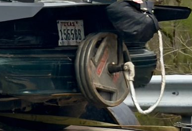
As one last experiment, there was another detail on that foxbody that caught my eye. There's a couple of weights hanging off over the rear bumper, clearly to add more weight on the rear tyres. Now, law of the lever says those weights are adding more load on the rear tyre than their mass suggests, so it's sort of like downforce. But at the same time, we're adding mass to the car, so it should be slower accelerating. We'll use the wingless car for this.
load += extra weight * (wheelbase + distance past rear axle) / wheelbase
//hanging 20kg 0.5m behind the rear axle is 24kgf of extra load on the tyres
mass = mass + extra weight
//mass increases by 20kg
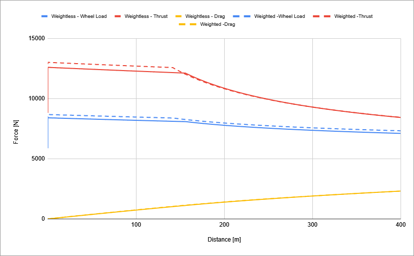
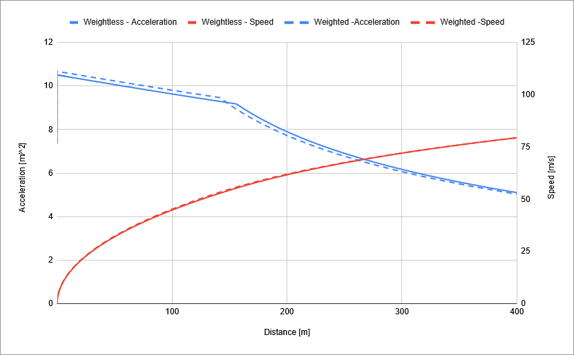
The time with the weights is 9.01, 0.05 seconds faster than without. Again, this is without tyre load sensitivity, but it does show that abusing leverage can help. Even more interestingly, if we take away leverage, and put 20kg directly on the rear axle, the car does the quarter mile in 9.03 seconds. It's still faster. This was shocking to me because I believed that any weight added within a car's wheelbase would produce slower acceleration. Sure, there might be more grip, but the mass would offset that. What I realise now is actually, weight distribution (or load distribution) is crucial when it comes to maximising traction. Again, this isn't including tyre load sensitivity, and at these margins reality might be less inclined to follow my quick 'n' dirty simulations, but it's still good information. Goes to show there's always more you can learn.
Of course, the car is still going to be slower when it isn't traction limited.
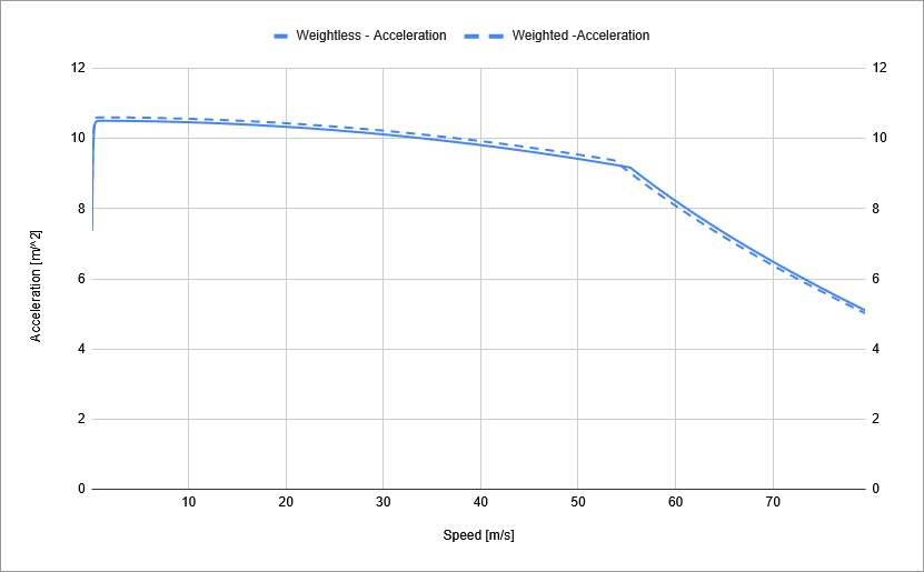
One final sanity check. Looking at acceleration against speed, the car with more mass is always going to accelerate slower once the cars are outside of their traction limited acceleration. Which does make the schemer in me wonder about carrying a ton of fuel in a car with a fuel burn rate designed around carrying the weight for the launch and burning it all of by the time the tyres are hooked up. Run incredibly rich in the first few metres, trying to consume fuel at an irresponsible rate, and then lean the car up with the goal to take a thimble of fuel all the way down the power limited part of the run, spluttering to empty right at the finish line. Or maybe just a ton of water that intentionally evaporates off in the cooling system, if you don't want to burn resources for the sake of a couple hundreths in improvements. Something to ponder...