


Forging a Path Through a Dead End
I’m either learning subtle quirks about CSS or I’m approaching the definition of insanity.
First order of business. It’s been a significant gap since my last post. This was due to laziness and that sort of dread you get when an idea isn’t working and you can’t stomach muscling it across the line. But hey, I’ve got this done now.
Second order of business. Everything you’re about to read was a learning opportunity without much tangible progress. With that said, I’m glad I got to write this because this is how a lot of work goes, and it’s easy to forget that a lot of creativity involves destroying a huge amount of time invested. It’s especially easy to forget that when everything is flowing and you feel like you can do no wrong, because you feel insane when you stumble. Try something, can’t figure out a way to make it viable, scrap it and start afresh. For the sake of flow, I’m not going to revise history from this new perspective. Instead I’ll quip at what I wrote previously, styled like this.
There’s a lot of things that seem like they’d be mildly amusing or interesting to document, but in the moment I’m so fixated on solving them that I’d rather not pause to consciously process what’s happening to type out notes or take a screenshot. And then there’s the question of if it’s worth documenting a problem that forever feels like its one line away from being fixed, or exclusively because of a weird quirk in my personal understanding. Here’s an attempt to buck that trend and at least demonstrate a fraction of the rapid fire trial and error process.
For emphasis. The post covering this stage of development has started with a warning about how none of this matters, and the stuff covered both barely covers what I tried, and is only incremental progress.
An artistic rendition of what I want to build would likely help:
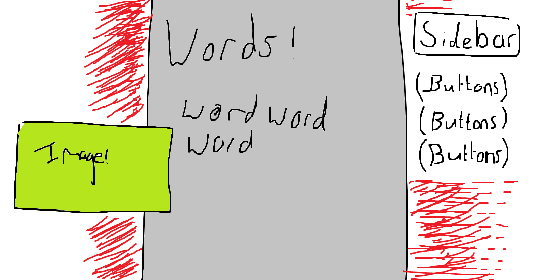
The red portions are meant to be gradients (although that’s still not set in stone) but by the time I realised how futile my attempts to render them in Paint were, I was very invested in doing this bit.
The troublesome aspect is that offset image. During this process, I thought my issue was that the image was within the content file that Eleventy reads and shoves into my layout template (and so would be afflicted with all sort of information limiting the text and other elements). I now know the issue is that the
floatproperty in CSS completely obliterates any other placement settings, so you can’t align images besides fiddling with margins (not viable for an unknown image width), and limiting the width of the container holding it (ditto).
The previous post in this devlog showed the layout split into a grid of three columns. In this case, I’d want the image to sit in the left and middle column. This isn’t so obvious because there’s no way to break the image out of the content file. Since the static site generator I’m using takes files and inserts them into a preset template, I can’t single out image and make them follow a different section of the grid.
It occurs to me I could probably do something like this:
<div class="content">
  <p>This is the text that comes before the image in the post</p>
</div>
<img>
<div class="content">
  <p>These are the words that come after</p>
</div>
But I object to that purely because there’s no way to automate it, and filling my writing with a bunch of extraneous HTML sounds like something that’ll bite my ass later. At the very least, I’d like to avoid the headache when I inevitably forget and get confused over the concept.
Other hackier ideas is to give images a consistent scale width and offset them by a fixed amount, but I like the organic sort of variation with different sizes of images, and also I can see that getting really odd looking with different aspect ratios. Imagine a tall, narrow portrait image having to sit as wide as a panoramic landscape. Alternatively I could build a frame to give everything more reasonable, squarer profiles, but again, variation is nice.
So. How do?
First of all, the grid has to be reduced to two columns, which is as easy as using the calc() function to combine them.
Typically in CSS, if you want to give a background to something, you can just tell it to be that colour. The trouble is that it fills the entire area like a bucket tool. For example:
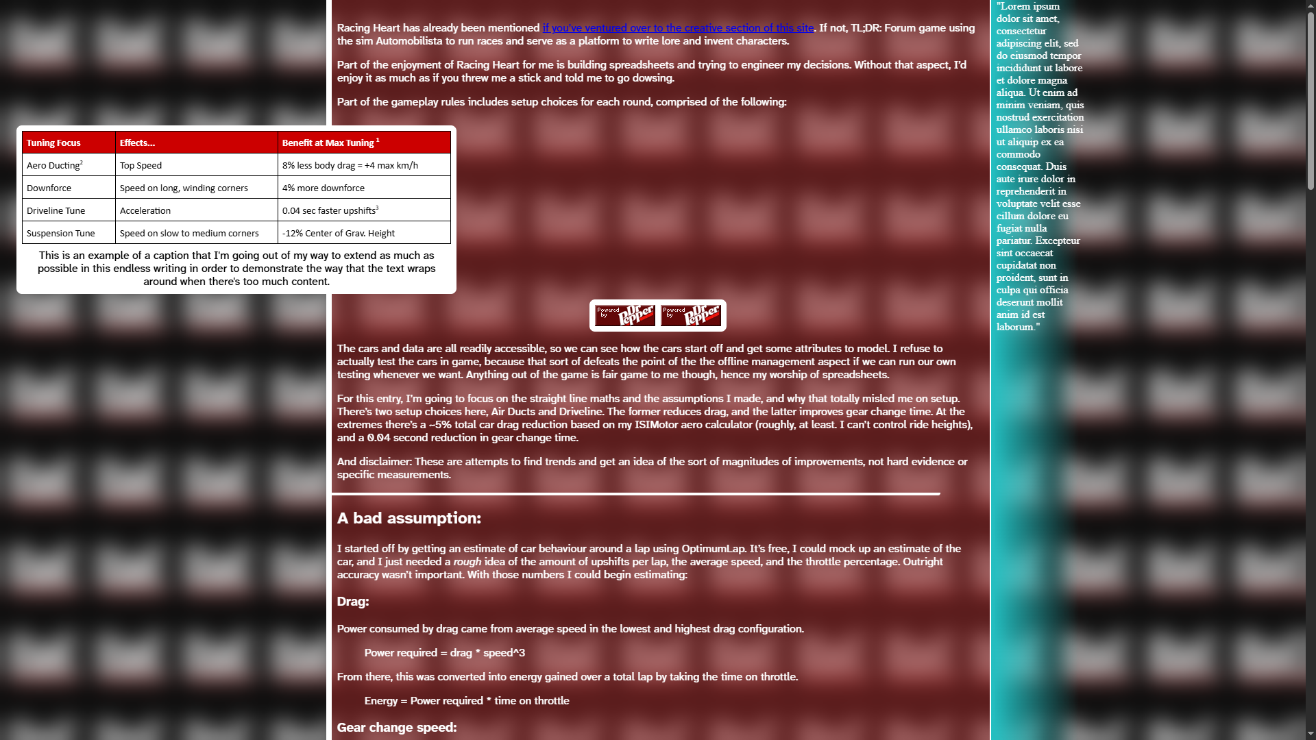
(The table is just a random png I had on hand. The random line in the middle is a horizontal rule that I haven’t got around to massaging - a problem for future me to address)
This isn’t what I want. The background is occupying the entire area, instead of a narrow band.
But if told to ignore images:
Which likewise, isn’t what I want. Although something about the sheer minimalism works conceptually (does it feel weird on the audience side for me to look at something so horrendous, and my reaction is, ‘hmm, I like the concept’? Because this entire series, especially in this skeleton state, feels like one long confession that I have no taste).
Anyway. With that ruled out, I separated the background into its own element, which is meant to fill the height of the text area, but sit underneath the text.
Oops. We can fix that by giving the background the property position: absolute; and its parent the property position: relative; The background also needs an updated margin (which is 100% of the area width, minus its own width, and setting z-index: -1; which ensures the text and images display on top of the background.
And now that’s starting to look better. The content fits in place using justify-self: end; and setting its width to all elements except images using the :not(img) tag.
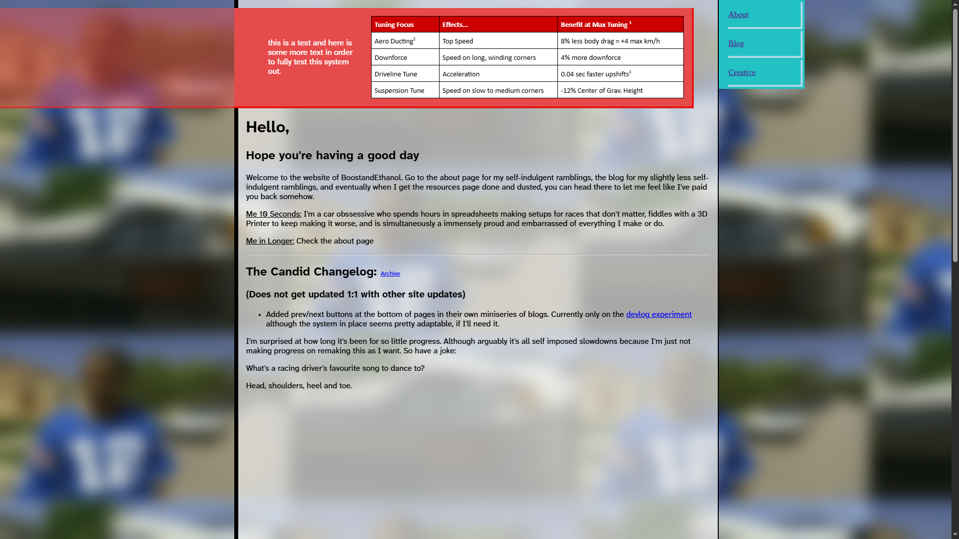
A couple of minor notes. The horizontal rule is still overflowing, as is the bullet point list. I sort of want to wait until I style them to fix them properly, but I believe it’s as simple as tweaking padding and max width. Oh, and as it turns out, I’d had the screen zoomed out so there’s a lot more spacing than there should be. Here is it displayed and the correct scale, with a couple other extras included. This time I’ve applied the layout onto on one of my blog posts.
The duplicate image at the top is to demonstrate another feature I’ve added. I know some pictures are going to want to be centred (mostly smaller ones, because if you look above, the image is always aligned as far left as possible and I can’t figure out a way to stop that. Ideally I’d want the image to go as far right as possible without intruding on the text), so I’ve added a way to enforce that if needed. Unfortunately, the way I’ve done it requires wrapping the image up with extra HTML and dressing - put a pin in that for now.
The horizontal rule and paragraph spacing on different elements are done by fine tuning the width of each element. I hope, on mobile where images aren’t offset, I can collapse all this down to one column that I won’t need to worry about any of this.
Shortcodes
As I just stated, wrapping up images in parent divs is generally not a great idea.
Centred images being wrapped up could cause problems down the line, for example if/when another redesign happens, now I’ve got a ton of blogposts with their own little variations and personalised details that I’ll have to account for. Some level of this is unavoidable and expected and could probably be accounted for fairly easily, but affecting every image on screen sounds suboptimal. Ideally, the posts themselves should be as free from styling as possible.
At the same time, I think it’s ridiculous to try and totally decouple my files from styling. Every single blogpost has some front matter data - a section at the top of the page that tells Eleventy certain details to set. It looks something like this:
---
title: Going Looser is the Most Tempting Trick in Car Setup
date: 2025-02-23
---
I’ll talk more about front matter at a later date. But basically, in my markdown files where I write these posts, code like that sits at the top of the page to establish certain details about a post. The point I’m making here is that nothing I write is really something I can cut and move somewhere else without treating it. Everything is already tainted with that data built into the file. So adding other Eleventy specific features to add style or control the layout seems acceptable. Knowing that, I feel slightly more okay with baking elements into my posts. Which makes me wonder if that piece of code I pitched near the top of this post would work…
Some Time Later
No. That was a fruitless endeavour, but at least I’ve figured out how the float property works.
And after being so mysterious the title of this section, shortcodes. TL;DR, you can write functions for repeatable features (like inserting images). This seems useful for me because I could write something very specialised, and if I ever change my mind, I can swap everything at once. The documentation seems fairly light on how to actually use it, but staring at it and taking my best guess seems to have produced something useable:
eleventyConfig.addPairedShortcode("img", function(content, source) {
    return  `<img src="${source}">
    ${content ? `<p>${content}</p>`: '' }`;
});eleventyConfig.addPairedShortcode("imgWrap", function(content, alt) {
return `<div ${alt ? 'class="centre-image-place">' : 'class="offset-image">'}
${alt ? `<div class="centre-image-dress">
${content}
</div>` : content}
</div>`;
});These are two functions. The top piece of code is for a function called img let’s me link to an image source, and add a caption to it (named content here).
The second piece is called imgWrap which is designed to hold images inside it, say for a gallery or collection of pictures. There’s a variable called “alt” which when true centres the image.
Together, these functions are called like:
{% imgWrap %}{% img "/image/link/here.png" %}Caption goes here{% endimg %}{% endimgWrap %}And in reality looks like:
Which yeah. As you can see, the stacked images where one is narrow, another is wide, leaves an awful blank space on the page. I don't want to build a system for styling images that requires thought and some minor shuffling and nudging to fit right, because that's using up mental capacity I could be using on getting an output.
For completeness, I realised I never demonstrated how bad this looks when really small images are thrown in.
Throwing in the towel
After all this effort and time sunk into making this work (zero, because I felt a compulsion to make this work, therefore no effort or time sunk), I’ve decided to can this concept. I’m going to place the images exclusively inline with the text.
The systems I’m writing are getting way too much for a simple blog. And for whatever level of information density offsetting the images out of the main body of text brings, it’s offset by the fact I get less control over the precise order someone reads a post. Something I think is hugely beneficial to understanding is seeing an image, then explaining it, which gets fuzzier when text and images mix and match. If I place an image, it’s to break your sightline to look at the image. Plus I’m not looking forward to having to adapt these same systems into mobile, and down the line. Creating my own specialised notation for inserting images, that I won’t even be using consistently, is just extra friction. Seems better to nip this in the bud before I throw more time trying to hack my way around a relatively minor feature that will probably frustrate me regardless.
Before I blow up everything I’ve done (it’s fine to kill it, I’ve got a clone to interrogate at a later date), one system that might be useful. To constrain floating images within some boundary, I added a grid layout as so:
grid-template-columns: 1fr calc(min(476px, calc((100vw - 968px)/2)) + 968px) min(476px, calc((100vw - 968px)/2)) 1fr;This displays as intended when on a 1920px wide monitor. There are four columns, of which the second is for the main content and the third is for the sidebar. The 1fr columns on either end are there for wider monitors, effectively filling in the dead space. As I started this post, the main section on my layout is 968px wide, and I want equal space on either side. This is where the min() function comes in, checking how wide the screen is, and capping the sections either side to be an equal share of 1920 - 968px. If the screen’s narrower, they equally split a smaller piece of the pie. So this might be useful for more variable grid setups in future.
This was… an experience. I hate accepting I can’t do something, but I really see no way to actually design my vision as intended. And besides that, I don’t think it’s a very good idea.
You are now caught up to present day.
So, that was for nothing?
No, that was learning. Although documenting it does make it sting more than otherwise. I like working on my own and throwing time into something, chasing ideas and trying to make them work. I get caught on weird mental snags that don’t bother me in my vacuum, but I get the sense I confuse and frustrate other people because, like a cat in a new room, I have to explore the perimeter before I can focus on the actual goal.
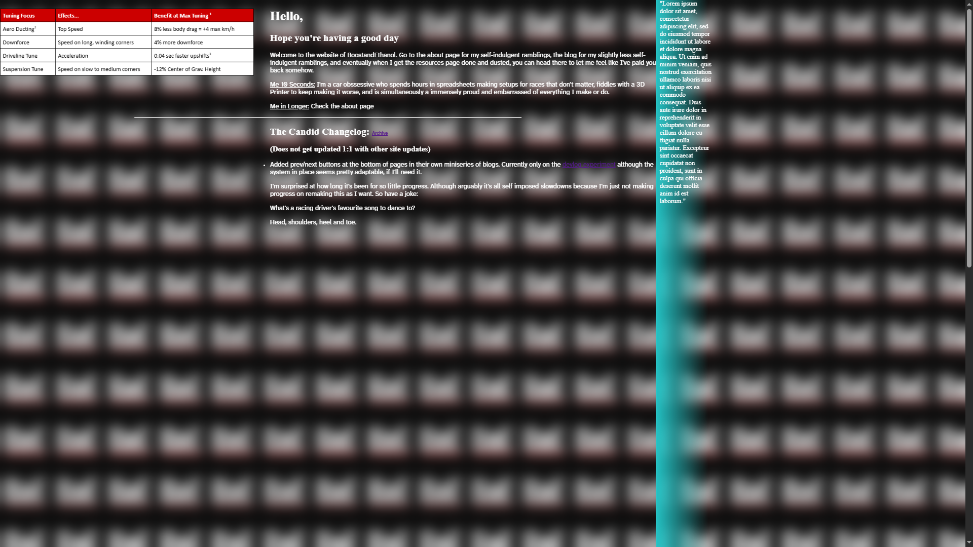
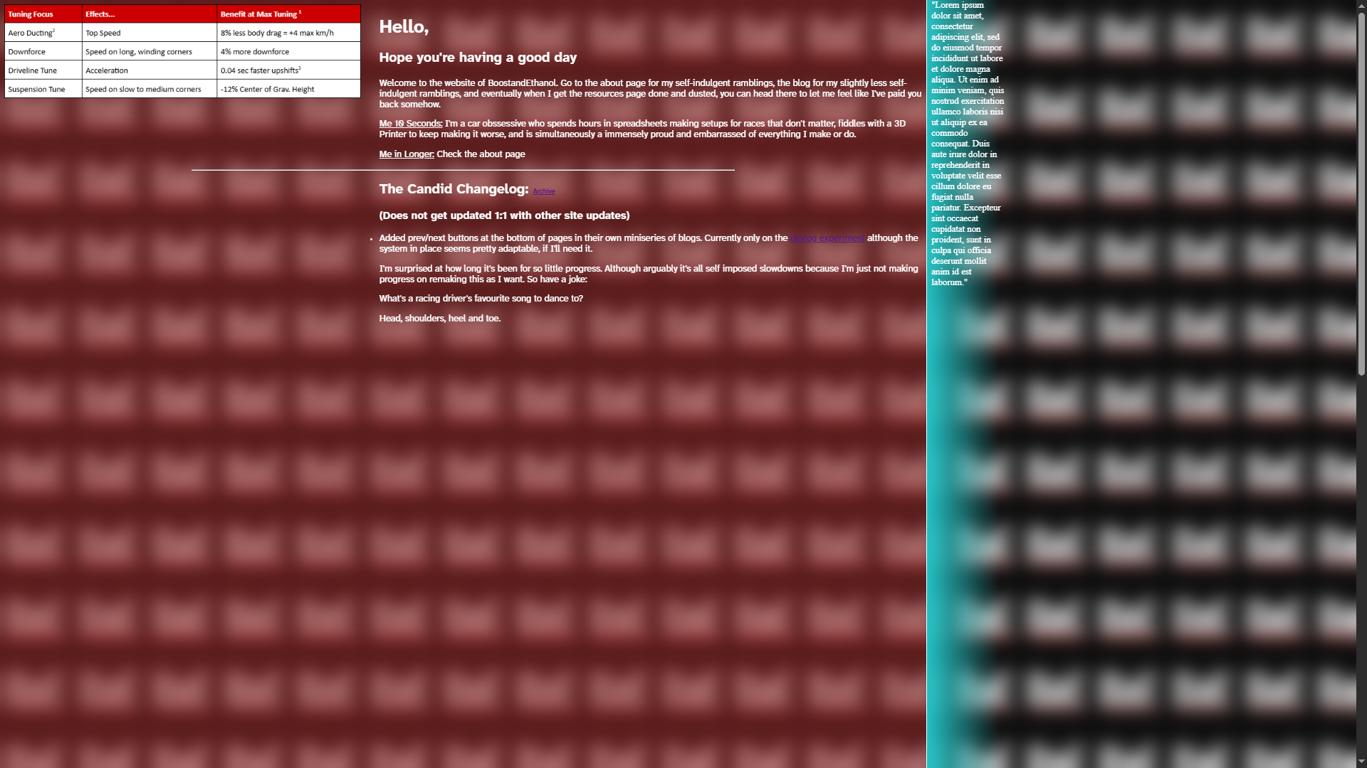
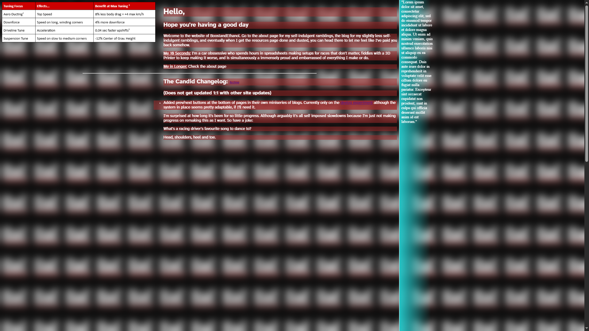
Getting back into the swing of things after having a month or two break isn’t too bad. My way of learning tends to be to focus on knowing where sources are and how to navigate them, than to learn the specifics. The brain is pretty sticky on the stuff used often, anyway. And I decided to get into a rhythm of working on a few ideas. So the layout now looks like so:
Which I concede, is a huge step in progress in a completely different direction after a lot of floundering about on one area. But that's fairly accurate, final 10% takes 90% and all that. There's a lot about this I don't like currently, but at least I'm letting new ideas brew in my head.
WIP Rundown:
- Sidebar buttons are absolutely temporary, but broadly in the right place and approximating some sort of aesthetic.
- Gradients looked like garbage and had to be disposed of. An accenting colour is still a must, but I'm not sure how best to go about that.
- I made a point about putting together a header at the end of the previous post. It's fairly clear to me how I'll do it, just another grid row at the top of the page.
I still wanted to somewhat incorporate the edges of the screen, hence the image getting a bounding box for captions, which is encompassed in a single div like so:
<div class="image-div">
  <p>Caption goes here.</p>
  <img src="image source">
</div>Yes, I did previously state that wrapping up images in divs isn't a great idea. But at least that's consistent and doesn't involve me creating a new and unique system. Shortcodes sort of lock me into a specific set of syntax and order, where I constantly need to maintain the structure I start out with as I want to include new features or find out I dislike a way a previous feature was included. Just leaving the HTML as front facing feels far more reliable, instead of designing shortcode which can account for every single feature of an element.
In my mind, this is locked in for the rest of time. One div is all the stylistic opportunities I’m allowing myself. It’ll be fine, I’m certain of it.
One other thing I want to draw attention to is how I do that extended piece to the edge of the screen. It just uses a :before… thingy… on the div surrounding the image.
.image-div::before{
  content: "";
  position: absolute;
  top: 0;
  left: calc((100vw - 968px)/2 * -1);
  height: 100%;
  width: calc((100vw - 968px)/2 );
  background: var(--tertiarytransparent);
  border-bottom: 4px solid var(--contrast_tertiarytransparent);
}
The sole missing detail is that .image-div needs position: relative; in order for this to display.
The maths logic by now is hopefully easy to parse. It calculates the width of one of the side portions, using the known width of the screen and the content section. Cut that in two and then offset by the same amount, so the big red transparent box is hanging across. And yeah, you can see the variables I'm now calling. I colour this site by having a CSS file dedicated to holding the colourscheme. That way I can call in different colours in different areas of the site.
By now this post is me putting off the effort of transferring this out of Google Docs and passing through every page to correct the weird experiments and random thoughts which cross my mind. So we'll call it here.