


Here's a mix of writings of opinions and analysis. Setup is loosely inspired by Taylor.Town.
Latest Post:
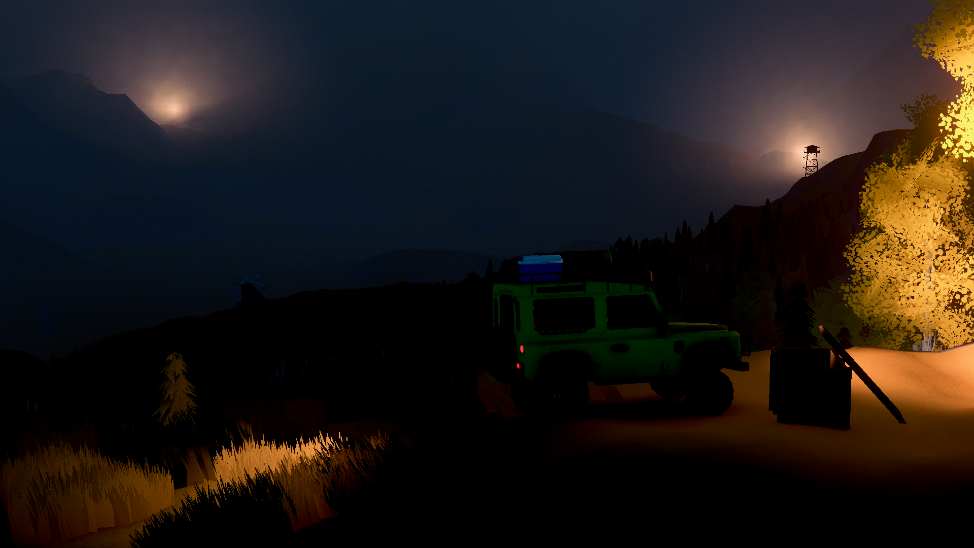
over the hill is Beautiful (2026-06-23)Link
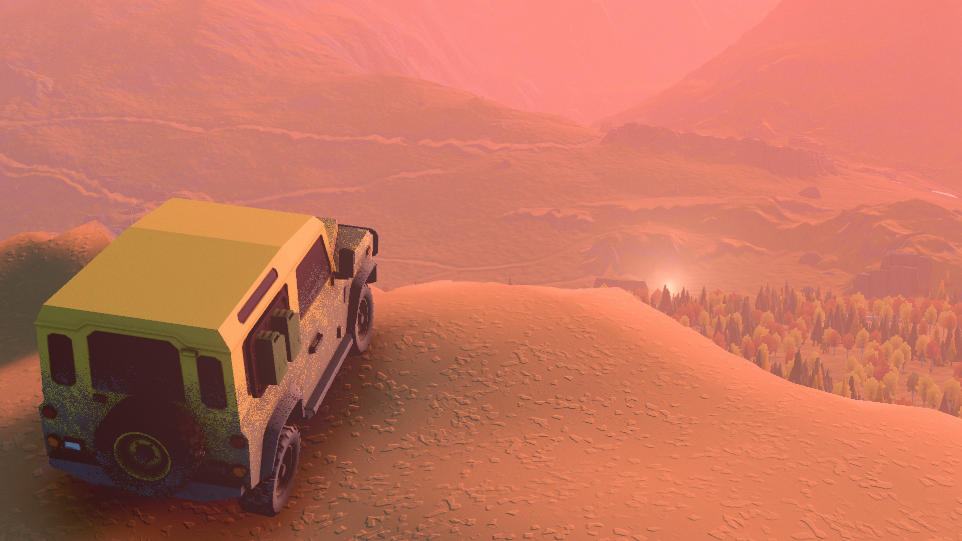
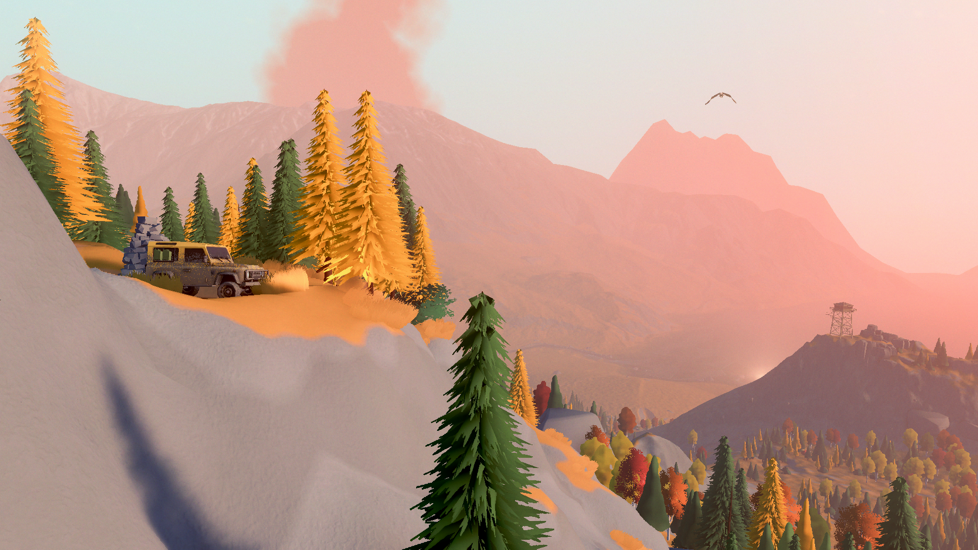
The demo to over the hill, Funselektor's latest low detail artistic love letter to cars has released with Steam Next Fest, and it is well worth your time.
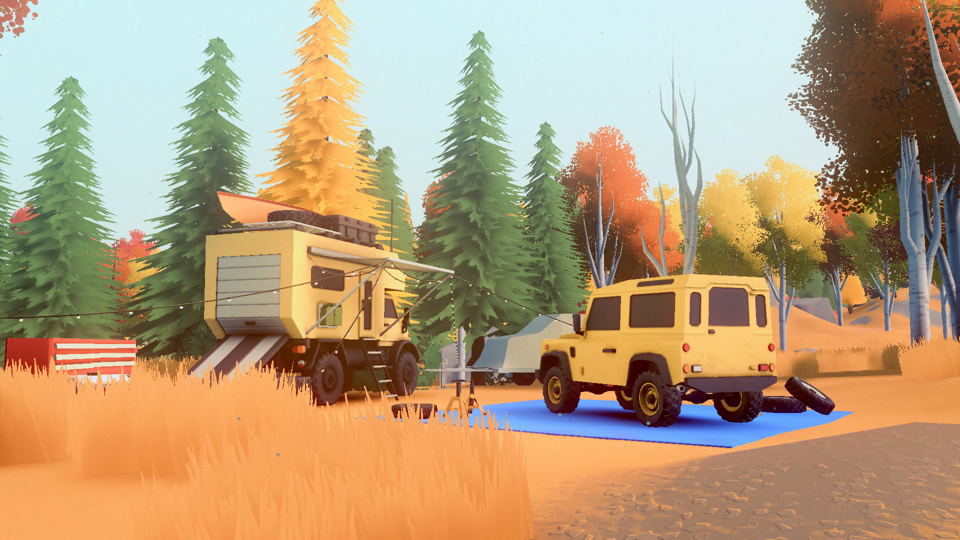
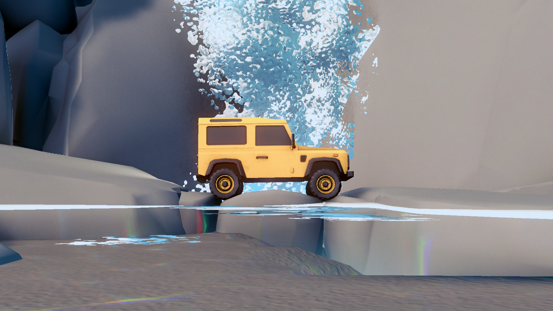
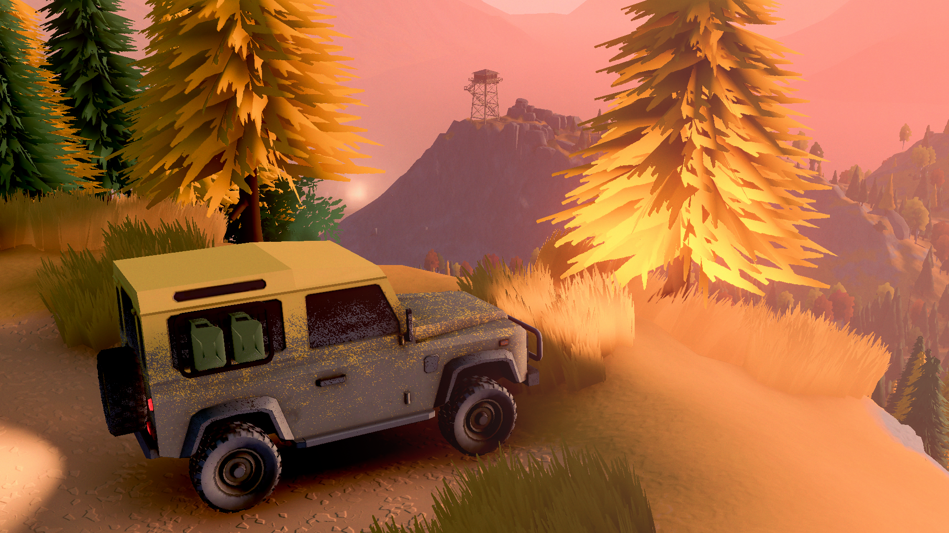
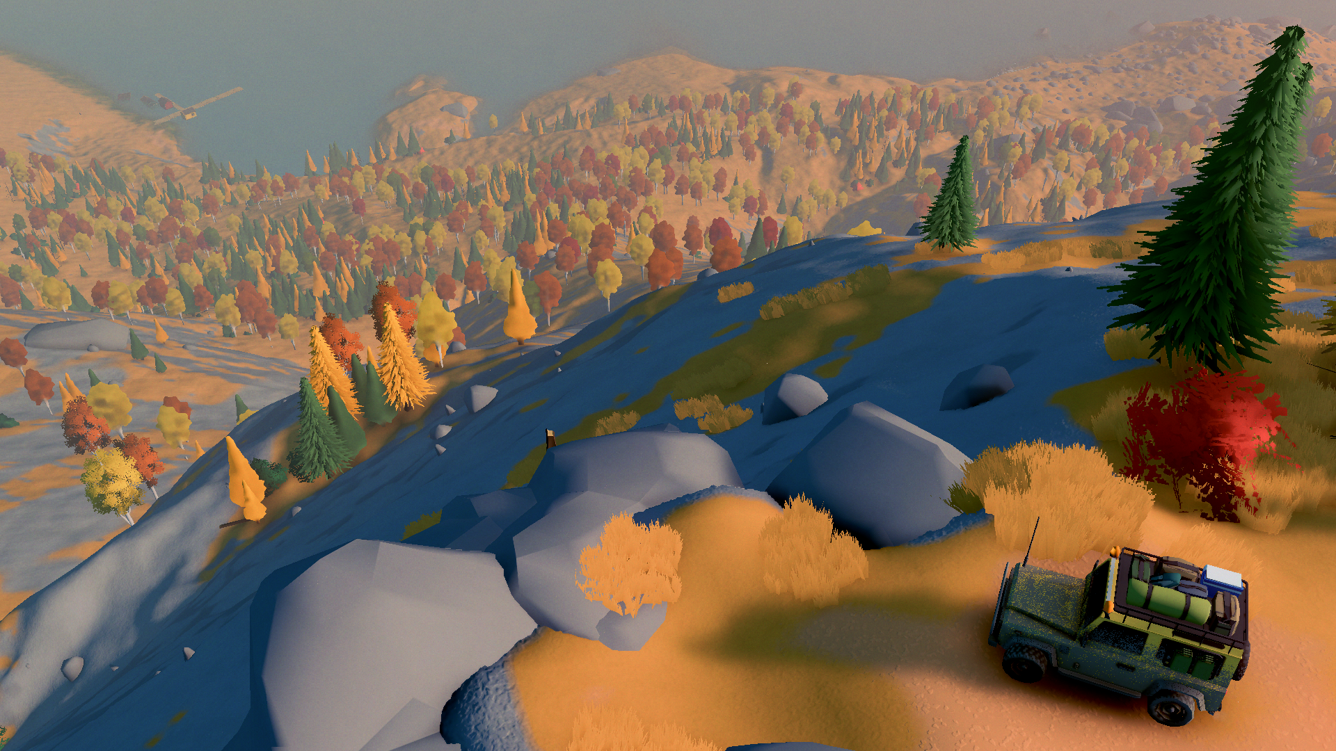
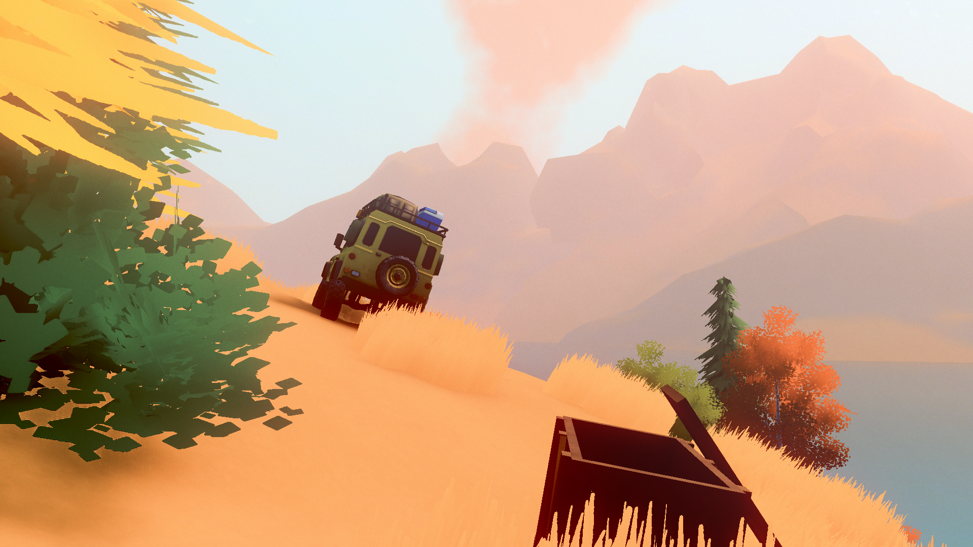
It's an easy going off-roading game about exploring a vast wilderness. You start off in a Defender, which I immediately turned into a Camel Trophy extra.
You get a winch!
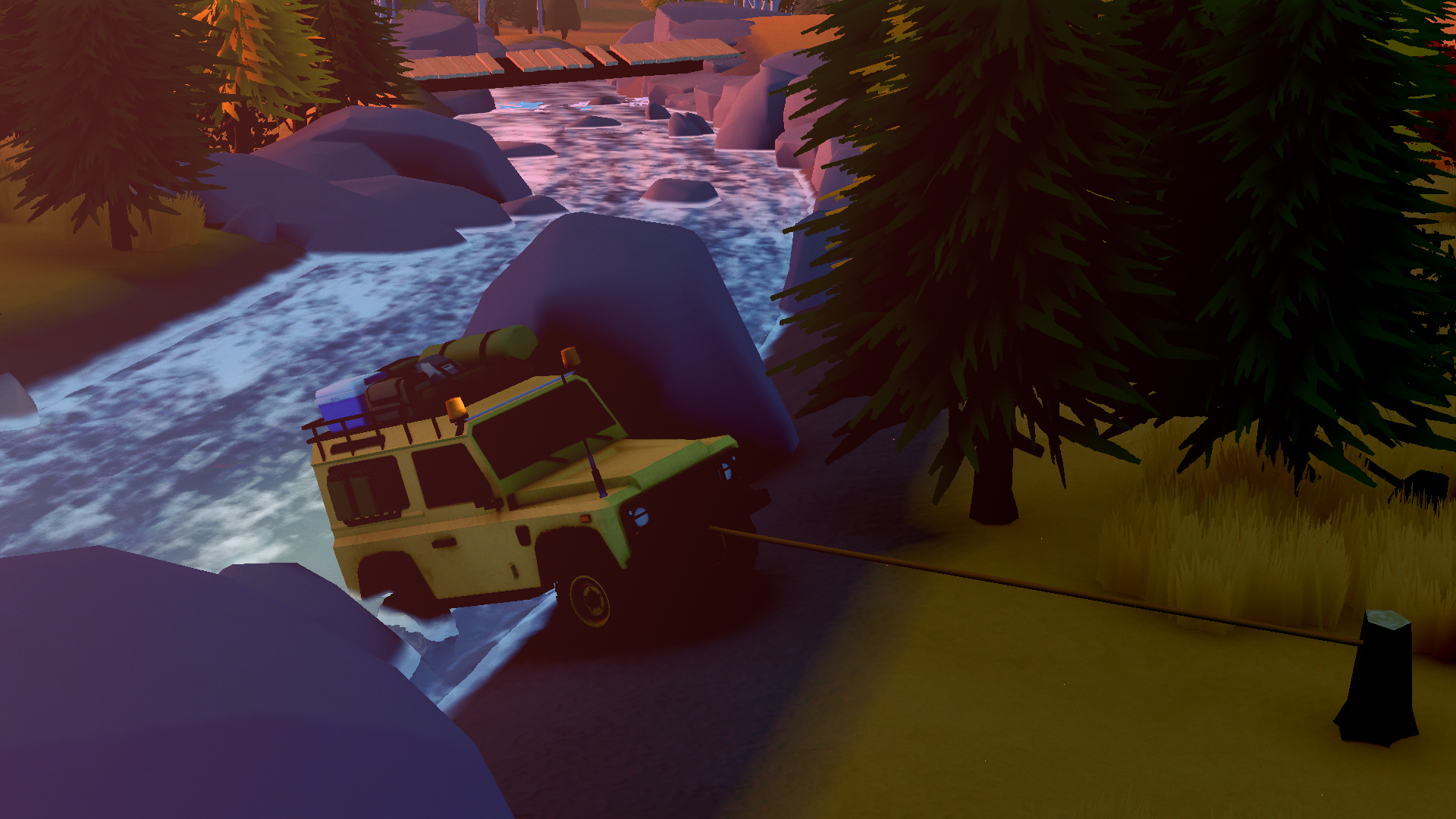
I can't show you this, because the game never truly pauses so taking action shots is not really viable, but this is secretly a Spider-Man game. The winch instantly hooks onto the nearest tree/anchor you're looking at, so on densely forested steep slopes, hooking from tree to tree with a grapple. There seems to be a small boost you get on initial hook, which you can use to your advantage by spam shooting/cutting the winch to create a bit of momentum.
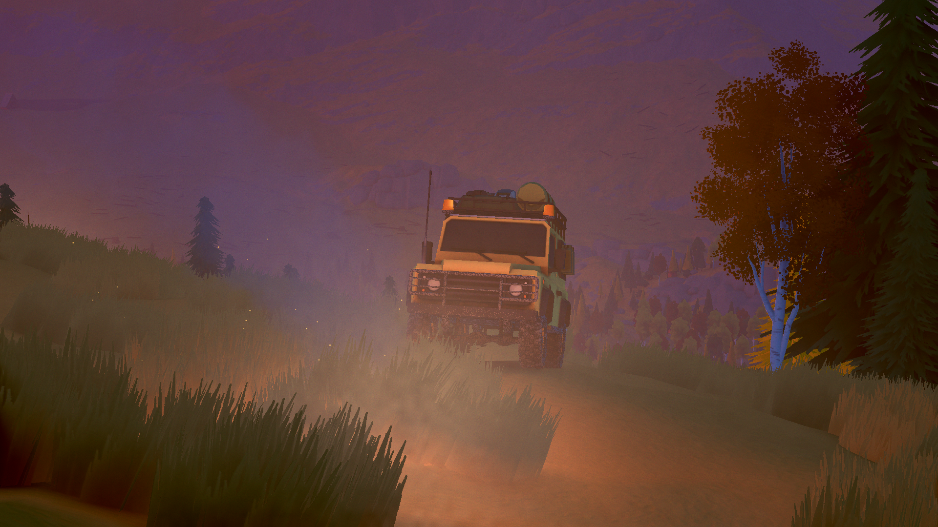
But largely it's a game about taking it easy. There's an immense satisfaction to making slow, steady progress.
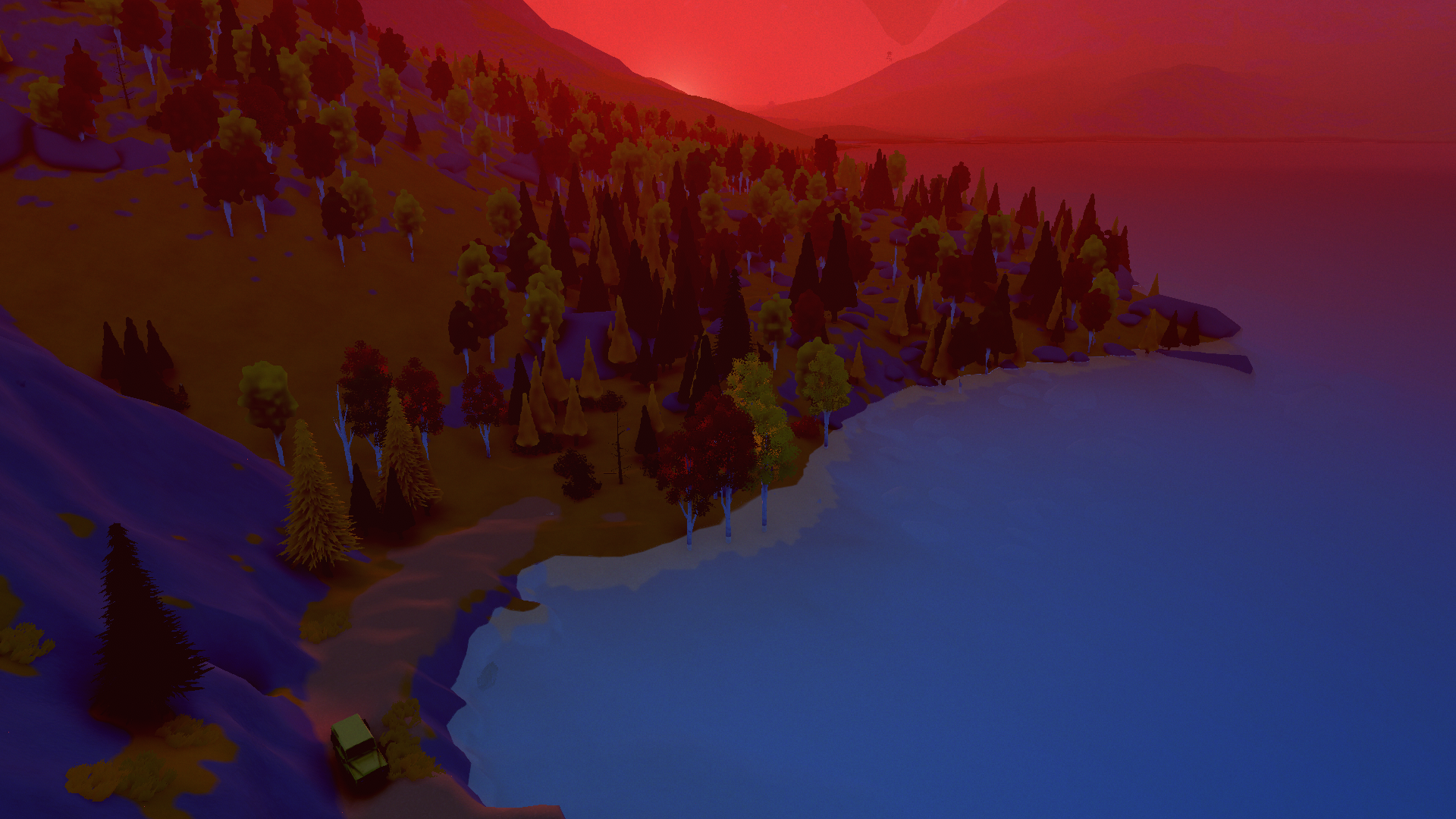
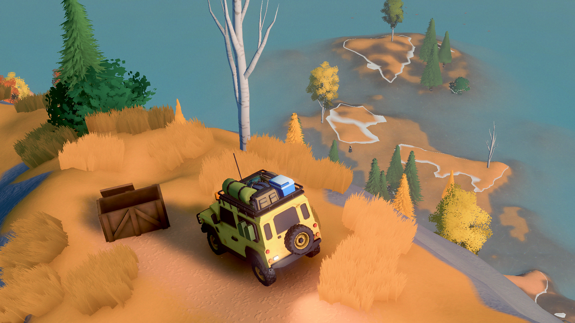
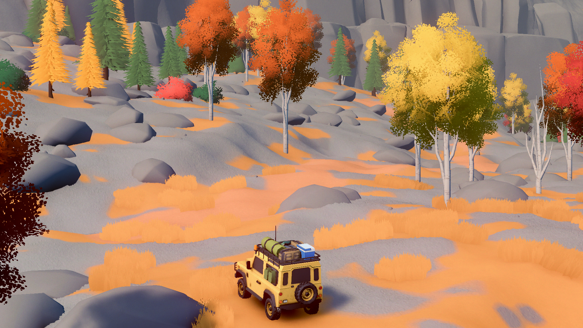
I took this picture to mark making it out of the other side of a dense, pathless forest. Seeing the trail on the other side felt like more of a reward than anything material the game could give me.
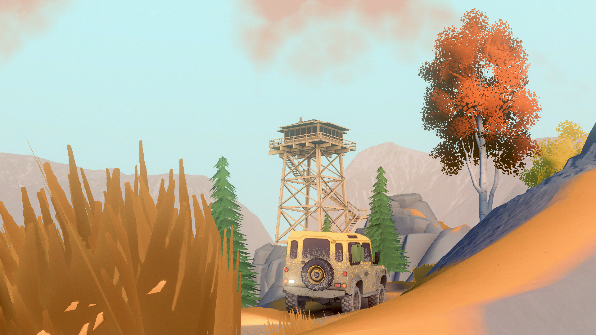
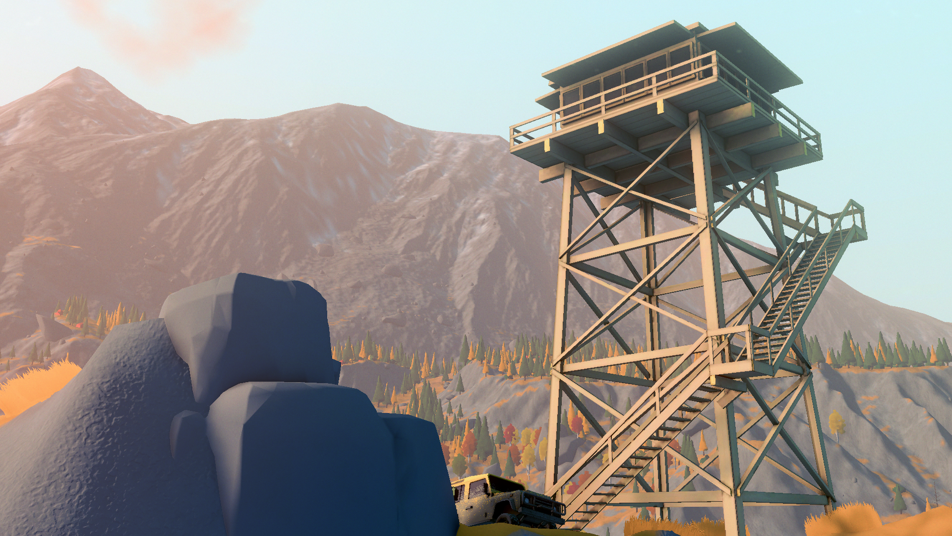
The game has lots of excuses to go off the beaten path. Exploring feels really satisfying when you inch your way up a steep slope. Collectables dotted about the map give you cosmetics.
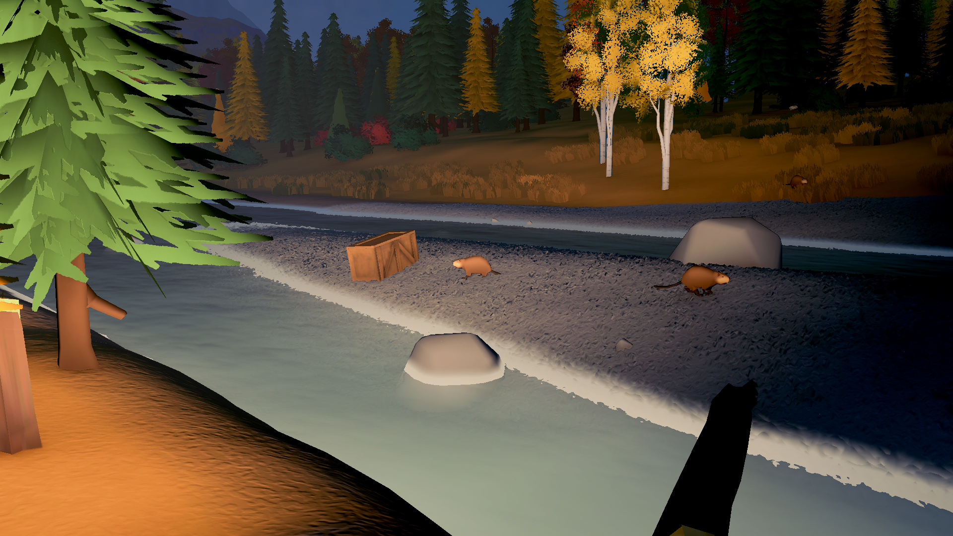
There's also a list of animals to take photos of.
Making it across the map, at least at first when the car's weak, feels like overcoming some serious obstacles. Exploring really feels like an adventure.
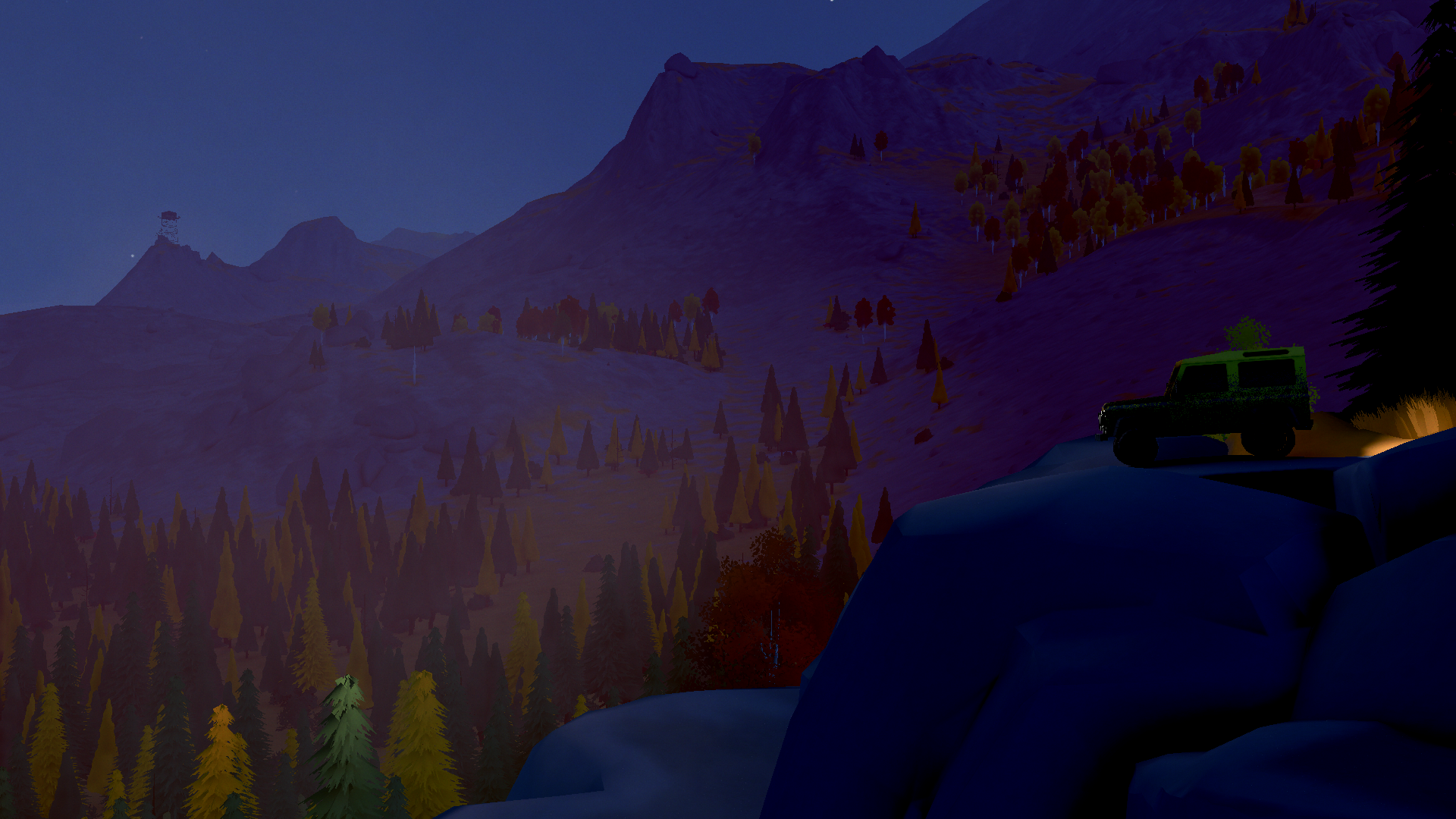
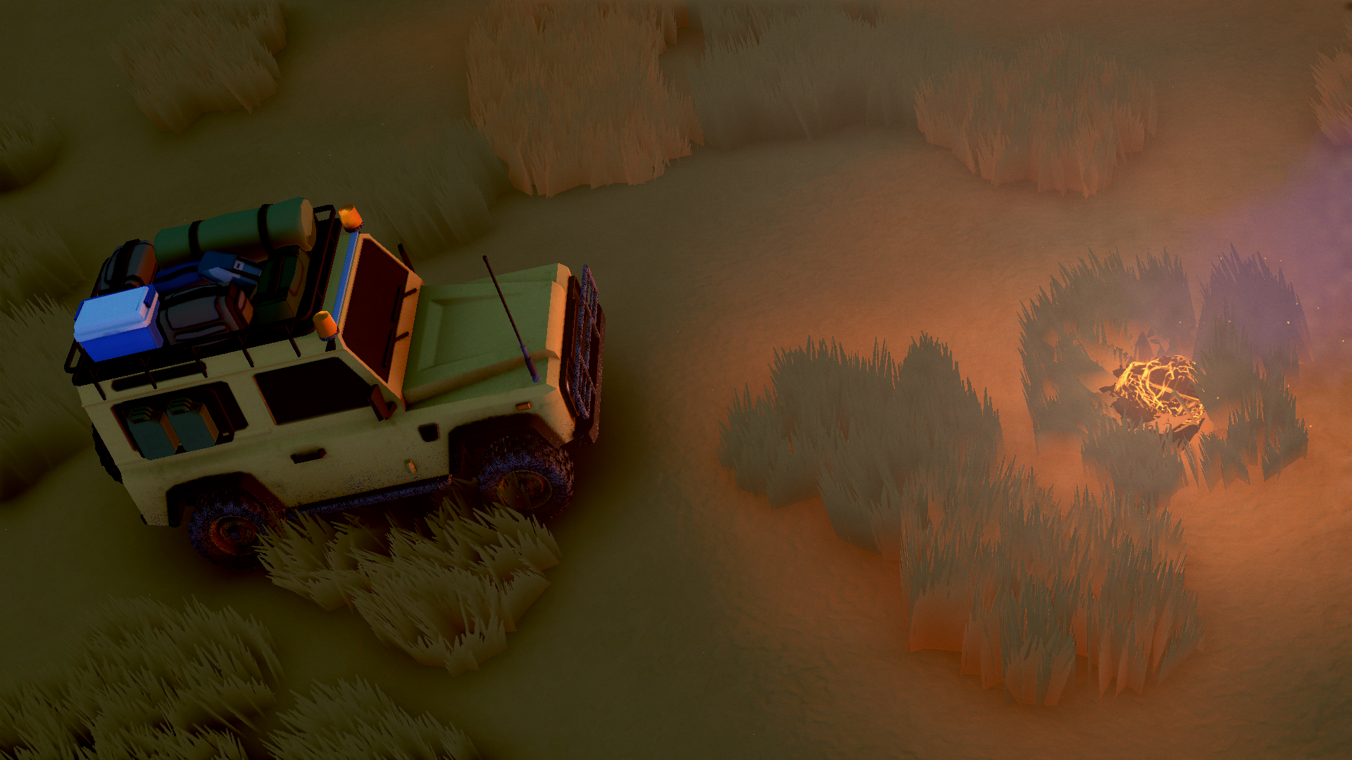
Finding meteors to make money for more upgrades is a welcome excuse to keep trailblazing.
The game is pretty heavy, I had to run the graphics at their lowest to run it comfortably, which is a low note. But at least the art style means the game doesn't suffer for the poor optimisation. It still looks quite pretty.
Well, aside from the dust effect on the car. But that's caused by gravel, which you'll learn to dispise as a seemingly simple slope becomes near impassable.
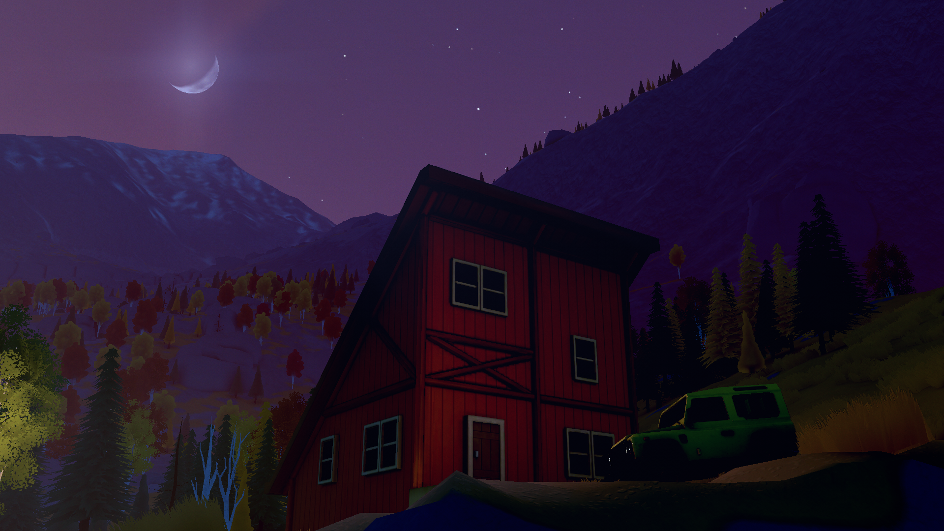
The demo gave me about four hours of playtime to get all the crates, cabins, and trails.
Now go and play it.