


Thinking
I wish CSS had a better organisation system. Just a way to nest blocks of classes in the same set of brackets to hide them out of the way would be so useful. Alas, that's not an option, so I'm typing here instead of working.
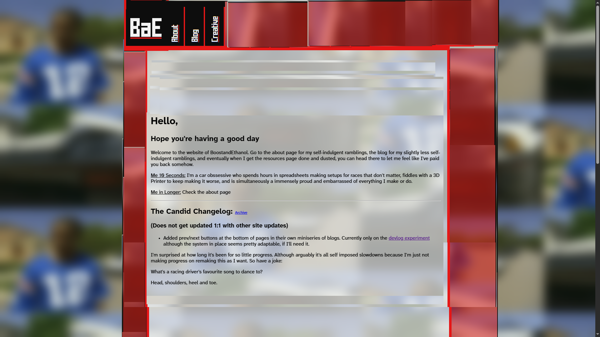
The simplest way of making the mobile design work is to torch the sidebar. I want it for aesthetic dressing, but nothing else.
Besides, the buttons looked a little hacky. About the only thing I will miss with adapting it is the LASER! Which is my far too dramatic term for when you highlight a button, it adds a trail of tertiary colour ::after to the side of the button.
Instead of that, I'm going to keep the same top bar setup. The sidebar would be nice to keep the buttons within reach at any point in the site, but at the same time, there's no reason to. It's not exactly a huge ordeal to scroll up or down a page. If you hit tab, it'll activate the header buttons anyway. There's no timesave other than me wanting to hang other areas of the site over you. Better to clean up the page and focus on the words of the area of the site you're in.
A bit of me thinks the site feels slightly more cohesive if there's something hanging at the top. So maybe I'll let something hang at the top if the page is tall enough, and remove the position: sticky; if you're on a smaller screen that would prefer the real estate. There's a slight itch of a concern in my head that I've seen complaints about sticky headers because the if you scroll by tapping the spacebar to go down a full screen, the browser isn't smart enough to tell that there's a header stuck to the top. I didn't have that issue previously because of the way I used a nested area within a grid for content that scrolled independently to the header, but that's also why I faced issues on mobile where the device couldn't figure out if I was trying to scroll the full page or the content inside. As I write this, I probably could've slapped a overflow: hidden; somewhere to solve that issue, although I think Safari at least likes to make everything elastic where possible regardless.
Anyway, the question is where to start on dismantling what I've done. Really, now I'm a fair way in, there's a lot I could probably neaten up. I'm going to avoid getting caught in that trap because that's usually something to handle when you're stalled for ideas of where to go. I'm not stalled, so I should focus on moving forward. When I hit a wall, I'll refine. The other though I'm having is if I should back up what I've built so far? I really don't have a solid idea of how to format backups and create points to restore to for making changes. Making a ton is just asking to have them get blindly thrown out for being too clumsy and space consuming. Yet I think I should have more than the single failed attempt I've got stored in a duplicate of my site at one point. A note of what exactly I was trying to achieve or where the site was would make sense.
2025-06-13
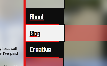
Laser sidebars when you hover over them.
Images are intended to be surrounded by an <div class="image-div"> to keep captions maintained and give them a cool effect.I don't know if this'll ever be used, but it's small enough for me to know I'll never have to give a damn about it, even if I make hundreds of them.
Now the question is how to scythe the layout. And how to adapt existing features. I don't have a plan for this.
Decided to chop the words too.
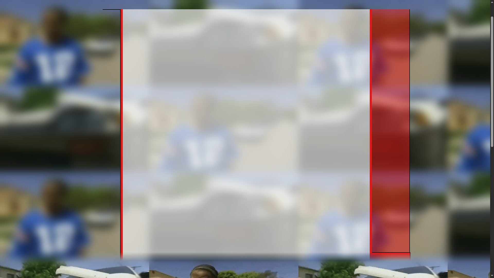
I like this because it pulls back the curtains. See how the black outline under my logo is a border attached to the left of the main body of content? There's also a little lump of a red bit in the bottom right corner, a detail I'm not totally in love with but I vaguely remember implementing because it made the gradient look better. The little change in width it adds is slightly more interesting, too? I'd like more of that stuff. Hopefully doing the same effect on the other side will even things out. More things are coming to mind as I stare at it. The colours, for example, are all done by having separate files for transparency. This is both annoying to reference and needless. I could just lower the opacity where needed, since I don't tune the shade when I go transparent-Except adjusting opacity impacts the borders and other details. So no, to my knowledge, the most obvious way is to just have another colour at the ready.
Side note. Do I need to address Xzibit in the background? Read here
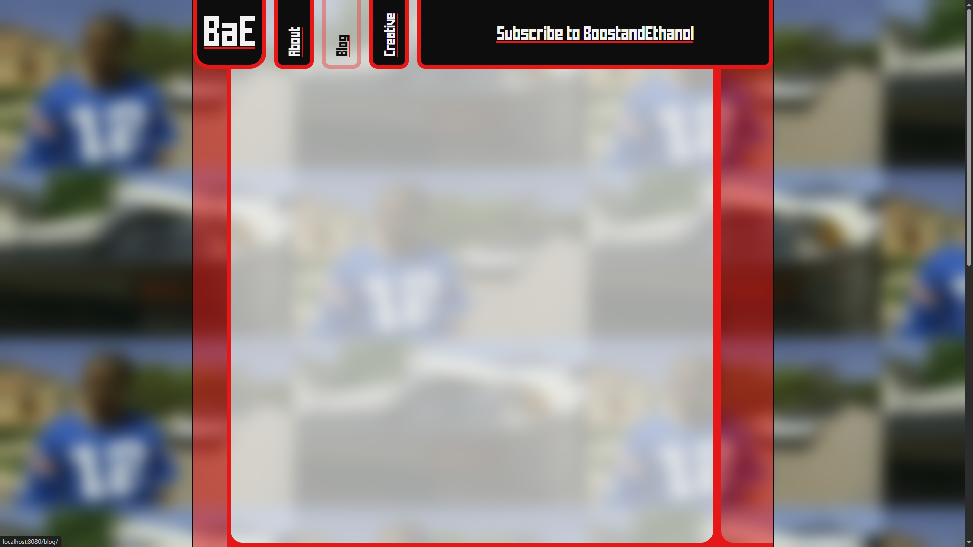
This isn't flashy, but I'm moderately liking this. The red across the bottom is so any sidebar buttons have a place to go on mobile. I'm thinking it'll hold say, a link to the RSS feed and such so I'll tailor it to each page. We'll see how it shakes out. Ideally I'd come up with a system to call relevant buttons and then make more!
It's at this point that the blocky slabsided modern sides of it aren't what I set out to do. Or at least, I'd hoped for something blobject-y. Trouble is, as you can see from my very square logo, my brain doesn't work in curves. The void of black at the top doesn't help either. It's lacking the gloss of Y2K nostalgia. Bright and bold contrasting colours don't help much either. More rounded corners would be sensible, if I can figure out how. I might curve the header a bit.
I get carried away.
This is looking alright! Decent? Something? I'm a fan of where it's going. The imbalance in border thickness is because to get the double curved effect on the right requires a border on each side. The gap's plugged by layering several divs over each other with varying border radii. I might thicken up the border on the left to match, as the longer I look at it the worse it feels.
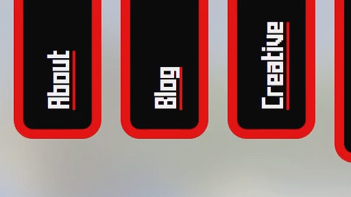
Other things. Helpfully one of the header buttons is highlighted in that screenshot. While I like the general shape, the effect to tell you it's a button hasn't sold me yet. Especially since I don't have an answer for how the home button changes, since that's an image. Better to come up with a style that works for both images and general text buttons. At the same time, clicking on a site's logo is how you get to the front page since time immemoriam. Perhaps I shouldn't be too concerned. What I may do is create a little house logo or something and transition the home button the house if it's focused/hovered over. But that doesn't answer how to keep the styling consistent.
The wider segment at the top (housing Subscribe to BoostandEthanol) is also a mystery to me. Right now, it just houses the title of the page. Fine for blogs and such, but I can't help but think it's a prime oportunity to display something more. The banners on a few of the creative pages seems obvious. It's currently a 686x128px area for an image, at least on the full width. for mobile I'll just move the area underneath the header and scale the height, I'm not worried about that.
Oh-I came back to do some more work and this post is dated over a week ago. One last thing.
Transitions feel good.